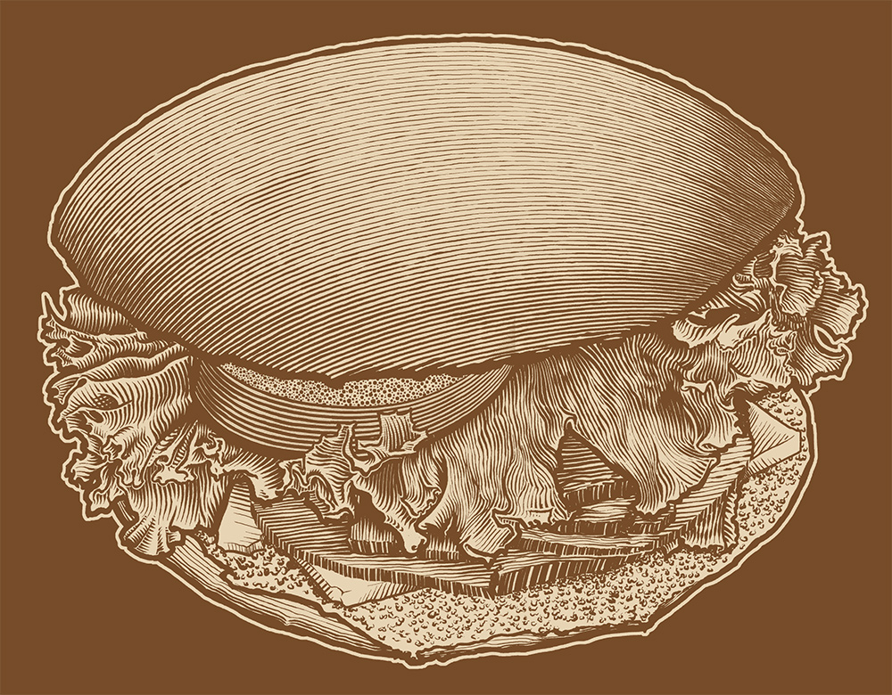
This is an illustration I did for a t-shirt I printed for a now defunct coffee shop. I chose this style because it reproduces well in spot color, and maintains the illusion of tone while appearing organic – unlike a halftone.
Sandwich Illustration
This entry was posted in Portfolio and tagged drawing, Engraving, illustration, Lettuce, scratchboard, Spot Color. Bookmark the permalink.

